


Ensuring Your Design Stands Out by Identifying Visualisation Flaws That Undermine Your Design
Ensure your visuals reflect your design’s true potential

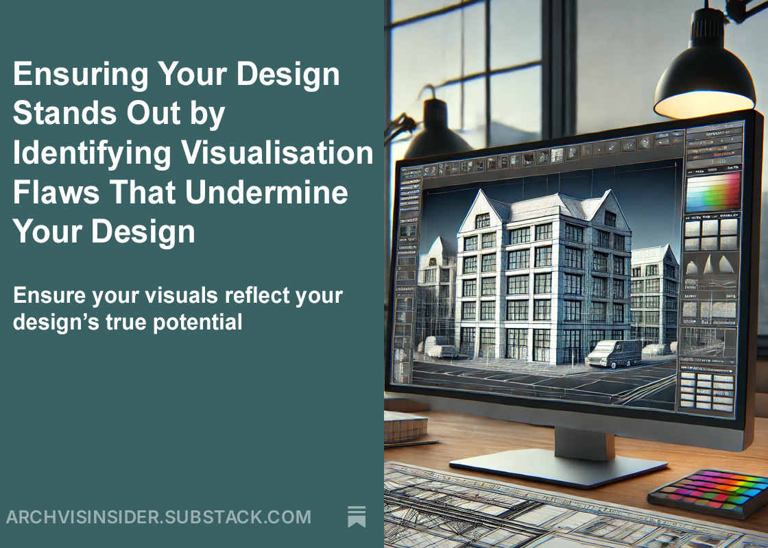
In today's newsletter, we'll take a closer look at how to spot the signs of low-quality visuals that can detract from your design's potential. Low-quality 3D images can undermine even the most well-thought-out concepts, leading to miscommunication and missed opportunities. By identifying key flaws early in the process, you can ensure your visuals effectively represent your design's true potential.
In today's edition, we will focus on:
⇨ Unnatural lighting that doesn’t reflect reality
⇨ Pixelated or repetitive textures
⇨ Simplistic, unrefined geometry
⇨ Camera angles that neglect key features
⇨ Lack of contextual elements to engage viewers
Let’s take a closer look at these critical elements that can make or break the quality of your projects 3D visualisations.
Unnatural lighting that doesn’t reflect reality
Lighting plays a pivotal role in making 3D images look realistic.
Unnatural lighting can make a design feel artificial and disengaging. Proper lighting should emulate real-world conditions, highlighting the design's key features and creating depth, shadows, and contrast that are consistent with how light behaves in reality. When lighting doesn't match these expectations, the visual becomes jarring, and the design loses its lifelike appeal.
Properly executed lighting helps bring out the beauty of the design and ensures it resonates with the viewer.
Pixelated or repetitive textures
Textures are a vital part of creating realism in 3D visualisation, and when they are low resolution or pixelated, they detract from the quality of the image.
High-quality textures help define materials like wood, stone, and glass, making the design feel tangible. When textures lack detail, they make the design appear unfinished and diminish its quality. Using crisp, high-resolution textures adds realism and helps the viewer connect with the design on a deeper level.
Quality textures are a crucial element in achieving photo-realistic visuals.
A quick word from our sponsor:
This weeks edition of the Architectural Visualisation Insider is bought to you by :


This week's edition is sponsored by Resolution Studios, specialists in transforming architectural and interior design concepts into photo-realistic 3D visualisations and animations.
If you're looking to elevate your design presentations, consider exploring their services at www.resolution-studios.co.uk

Simplistic, unrefined geometry
Simplistic geometry in 3D visualisation can undermine the realism of the final image.
In the real world, objects have intricate shapes and textures that create depth and authenticity. When 3D geometry is overly basic, with flat surfaces or sharp angles, the design feels unnatural and unrealistic. This lack of detail not only reduces the visual impact but also risks disengaging the viewer, as they may struggle to connect with an image that doesn't reflect real-world complexity.
Detailed geometry makes your designs more believable and engaging.
Camera angles that neglect key features
Camera angles in 3D visuals are often underestimated but play a crucial role in highlighting a design’s key features.
Selecting the right camera angle ensures that the most important elements of a design are visible and emphasised. When framing a shot in a 3D model, it’s essential to consider the foreground, background, and how these components interact within the chosen perspective. A well-thought-out camera angle directs the viewer’s attention to focal points, presenting the design in its best form and capturing its essence.
The right camera angle maximises a design’s impact and draws attention to its standout features.
Lack of contextual elements to engage viewers
Without context, a 3D image can feel incomplete and fail to captivate the viewer.
Incorporating realistic elements, such as furniture, cars, trees, or people, enhances the viewer's understanding of the design's scale and purpose. These details create a relatable and immersive environment, helping the design feel connected to the real world. Without this added context, the visual risks appearing isolated or unpolished, which can undermine its effectiveness and believability.
Adding contextual details is essential for crafting visuals that feel authentic and resonate with the audience.
Recognising these flaws early on can help prevent low-quality visuals that undermine your project’s potential. By focusing on the details, such as lighting, textures, geometry, camera angles, and context, you can create 3D images that are realistic and clearly communicate your vision.
Conclusion
Identifying low-quality visuals early can save your project from losing its impact.
Focusing on key elements like realistic lighting, detailed textures, and accurate geometry ensures your 3D images look realistic and engaging. Proper camera angles and contextual details further enhance the visual's effectiveness by providing a sense of scale and purpose. These details are crucial to making sure your design resonates with your audience.
By addressing these aspects, you guarantee your visuals communicate your design’s true potential.
I hope you’ve enjoyed todays edition of the Architectural Visualisation Insider, if you haven’t already done so, please subscribe to be notified of future editions.
Speak soon,
Jamie
P.S. We’re hosting a free webinar, ‘An Introduction to Architectural Visualisation’ over the next few weeks.
Please check the link to find out more information and what will be covered and select your preferred time and dates.
We look forward to seeing you there.