


3 Common Visual Mistakes (And How to Fix Them Fast)
Small changes that make a big difference to your 3D visuals

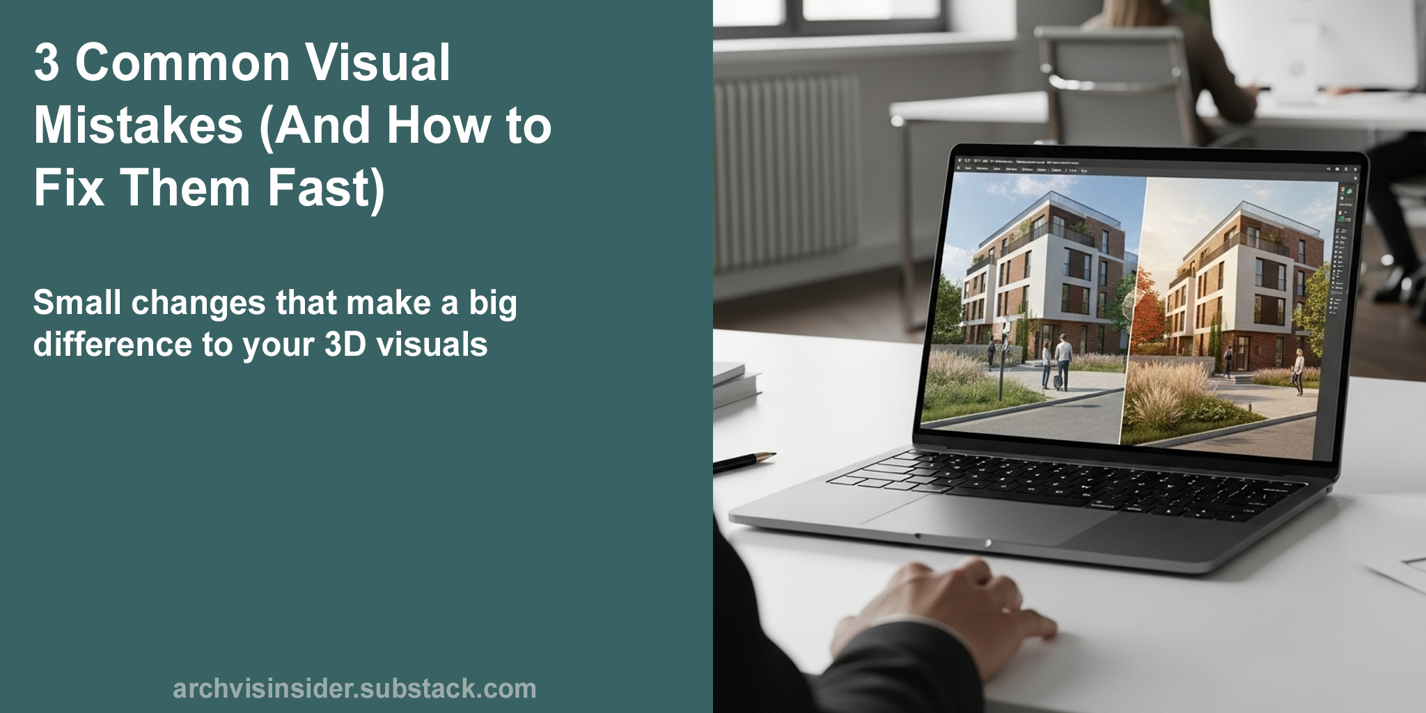
Hi
In today’s newsletter, we’re taking a closer look at three common visual mistakes that can quietly weaken your 3D renders, and how to fix them fast. These aren’t dramatic overhauls or time-consuming edits, just smart adjustments that sharpen your message and make your visuals easier to understand. Whether you’re working on client presentations or planning submissions, small changes in framing, lighting, and layout can go a long way.
In today’s edition, we’ll cover:
⇨ How camera angles affect trust and realism
⇨ Why foreground clutter can dilute your message
⇨ The role of lighting in adding atmosphere and depth
Let’s take a closer look at how these strategies can help your architecture stand out with less effort.

A quick word from our sponsor:
This week’s edition of the Architectural Visualisation Insider is bought to you by :

Resolution Studios specialise in transforming architectural and interior design concepts into photo-realistic 3D visualisations and animations, helping architects and interior designers effectively showcase their projects.
If you're looking to enhance your design presentations, consider exploring their 3D services - www.resolution-studios.co.uk

Adjust the Camera Angle to Make Your Renders Feel Real
Your camera position can make or break the story your visual tells. Get it wrong, and even the most polished render will feel oddly disconnected.
It’s all about perspective.
When the camera is too high or low, it distorts the proportions of the building and makes it hard to judge scale. The viewer is left trying to make sense of a scene that doesn’t feel grounded or relatable. Instead of experiencing the architecture, they’re distracted by the awkwardness of the view. This is especially important when the image is doing all the talking, no drawings, no explanation.
A strange angle weakens everything else.
Thankfully, this is an easy win. Adjusting your viewpoint to match how someone would naturally see the space helps the render feel grounded and trustworthy.
Realism starts with viewpoint.
By placing the camera at a typical human eye height, around 1.6 to 1.8 metres, you make the scene feel familiar and immersive. Vertical lines stay vertical, which keeps the building looking stable and balanced. This subtle shift in framing helps people imagine themselves in the space, rather than just looking at it. It’s a small adjustment that creates a big sense of clarity.
Natural perspective builds trust.
If your render feels a little off, the camera angle is the first thing to check. Framing the image at eye level instantly makes your visuals easier to understand and more enjoyable to view.

Clean Up the Foreground to Let the Architecture Stand Out
Foregrounds often get filled in last, but they’re one of the first things people see. If they’re busy or distracting, they can pull the whole image off track.
Not everything needs to be in shot.
When the foreground is packed with paving patterns, oversized trees, or generic people, it draws the eye away from the actual architecture. This visual noise makes it harder for the viewer to focus, causing them to miss key details or misunderstand the space. It can also give the render an artificial, overly staged feel, like a stock image rather than a design presentation. In short, the more the foreground shouts, the less the building gets heard.
Too much detail makes the message unclear.
A strong foreground doesn’t mean a full one. With a few intentional choices, you can guide the viewer’s eye where it needs to go.
Good visuals lead the eye.
By stripping out unnecessary clutter and using soft landscaping, clear paths, or low walls, you frame the building instead of overwhelming it. This makes the render feel composed and confident, not thrown together. Foregrounds work best when they’re understated and purposeful, helping to anchor the scene without taking over. It’s not about filling space, it’s about shaping attention.
Clear foregrounds give clear messages.
Foregrounds set the tone for the entire image. Keep them simple, supportive, and on message, and your architecture will do the talking.
Refine the Lighting to Add Depth and Atmosphere
Lighting sets the mood long before someone notices the materials. If it’s off, the entire scene can feel flat, no matter how strong the design is.
It all looks a bit washed out.
When lighting is too soft, dull, or harsh, it flattens surfaces and kills the sense of depth in the scene. Details blur together, shadows vanish, and the building loses its character, it starts to feel like a grey box rather than a lived-in space. That lack of atmosphere makes it harder for clients or planners to connect with what they’re seeing. It’s not just an aesthetic issue, it’s a clarity issue too.
Poor lighting hides good design.
The right lighting doesn’t just show the building, it shows it at its best. With a few simple shifts, you can bring realism, warmth, and structure into the frame.
Light brings buildings to life.
By using angled lighting, like you’d find in the morning or late afternoon, you create depth, softness, and contrast without overpowering the scene. It gives materials their richness, helps shapes read more clearly, and subtly guides the eye across the image. Controlled shadows add dimension, while gentle highlights pick out the structure’s form and features. You’re not just lighting a model, you’re shaping how someone feels about the space.
Good lighting makes your render believable.
Lighting is more than a technical setting, it’s a design choice. Get it right, and your visuals will feel natural, inviting, and easy to understand at a glance.
Clarity in your visuals builds confidence in your design
one thoughtful adjustment at a time.
Summary
Getting your visuals right doesn’t always mean doing more, sometimes, it’s about knowing what to remove or adjust.
From camera angles that make a scene feel natural, to foregrounds that support rather than distract, to lighting that adds clarity and atmosphere, these small changes make a noticeable difference. When your visuals feel grounded, composed, and believable, they’re easier to read and more persuasive to your audience. The goal isn’t just realism for its own sake, but clearer communication of your design intent.
Good visuals don’t just show a project, they help people understand it at a glance.
I hope you’ve enjoyed this weeks edition of the Architectural Visualisation Insider, if so please let me know in the comments or give it a like, and if you haven’t already done so, please subscribe to be notified of future editions.
Speak soon,
Jamie